
Pullman Transit
UX/UI | Mobile App Redesign

Project Summary
1 month | April - May 2022
UX/UI Designer
Responsive App Prototype
Tools


Company Background
Pullman Transit is an app used by a majority of Washington State University students. Its purpose is to provide tracking information for the buses in the town of Pullman, and allow users to locate and track the available buses in real-time, helping them reach their destinations efficiently. I was inspired to work on this redesign as I and many others have experienced challenges when navigating throughout the app's interface.
Problem Statement
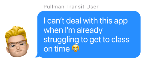
The current interface of the Pullman Transit app has been found to be challenging and frustrating to navigate, particularly when trying to locate available buses. Many users, who are predominantly college students already dealing with numerous sources of stress, report difficulty in figuring out where to start when opening the app and finding the correct bus for their destination. As a result, the app's user interface is causing unnecessary stress and confusion for its users, which should not be the case for an app designed to help people easily get from point A to point B.
Solution
To address the identified pain points, a redesign of the Pullman Transit app was undertaken. The focus of the redesign was on creating a more user-friendly and straightforward interface, allowing users to navigate the app with ease and locate the appropriate bus for their destination. The redesign incorporated improvements such as a revamped landing page, streamlined navigation, and a search function for finding buses, resulting in a more intuitive and efficient user experience.
Research
Understand the User
To start the project I conducted some user interviews in order to learn the user's problems and barriers when utilizing the Pullman Transit app. After going through the interviews, I was able to conclude different pain points.
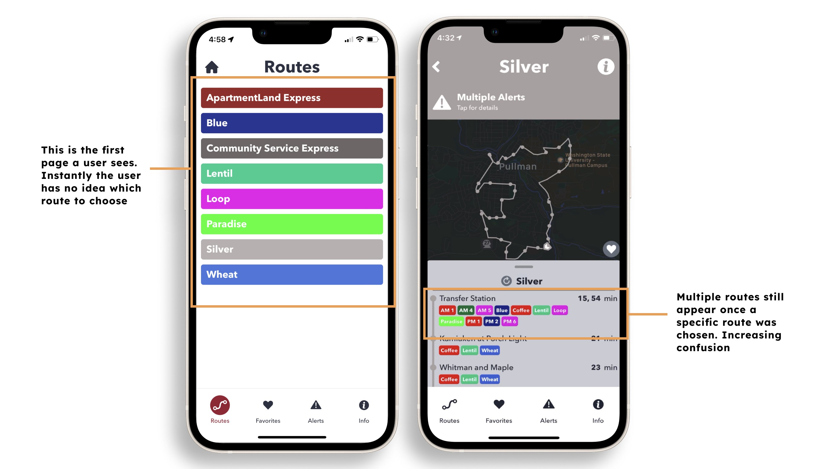
All 5 out of 5 participants have found it difficult to locate the buses that would be currently running. This frustrates them since they believe this type of information should be readily available right when the app is opened.

Additionally, 3 users mentioned that the landing page of the app was a significant pain point. They found it challenging to determine where to begin when searching for the correct bus to take them to their destination.
App Store Reviews
Outside of my user interviews, I decided to do more research on what reviews have been left on the app. Just from a glance it is clear that the app is not well received by their audience scoring a 1.2 out of 5 star rating. One review caught my attention because it mentioned issues similar to what I found in my interviews, specifically the app's poor user interface. The reviewer called it "one of the worst designed transit apps I've ever used."
Pullman Transit App
Google Maps

Transit

Define
So what's the problem?
The current interface of the Pullman Transit app has been found to be challenging and frustrating to navigate, particularly when trying to locate available buses. Many users, who are predominantly college students already dealing with numerous sources of stress, report difficulty in figuring out where to start when opening the app and finding the correct bus for their destination. As a result, the app's user interface is causing unnecessary stress and confusion for its users, which should not be the case for an app designed to help people easily get from point A to point B. A redesign is necessary to make the app more user-friendly, straightforward, and effective in meeting its users' needs.
Traditional User

Mapping Out the User's Flow

Ideate
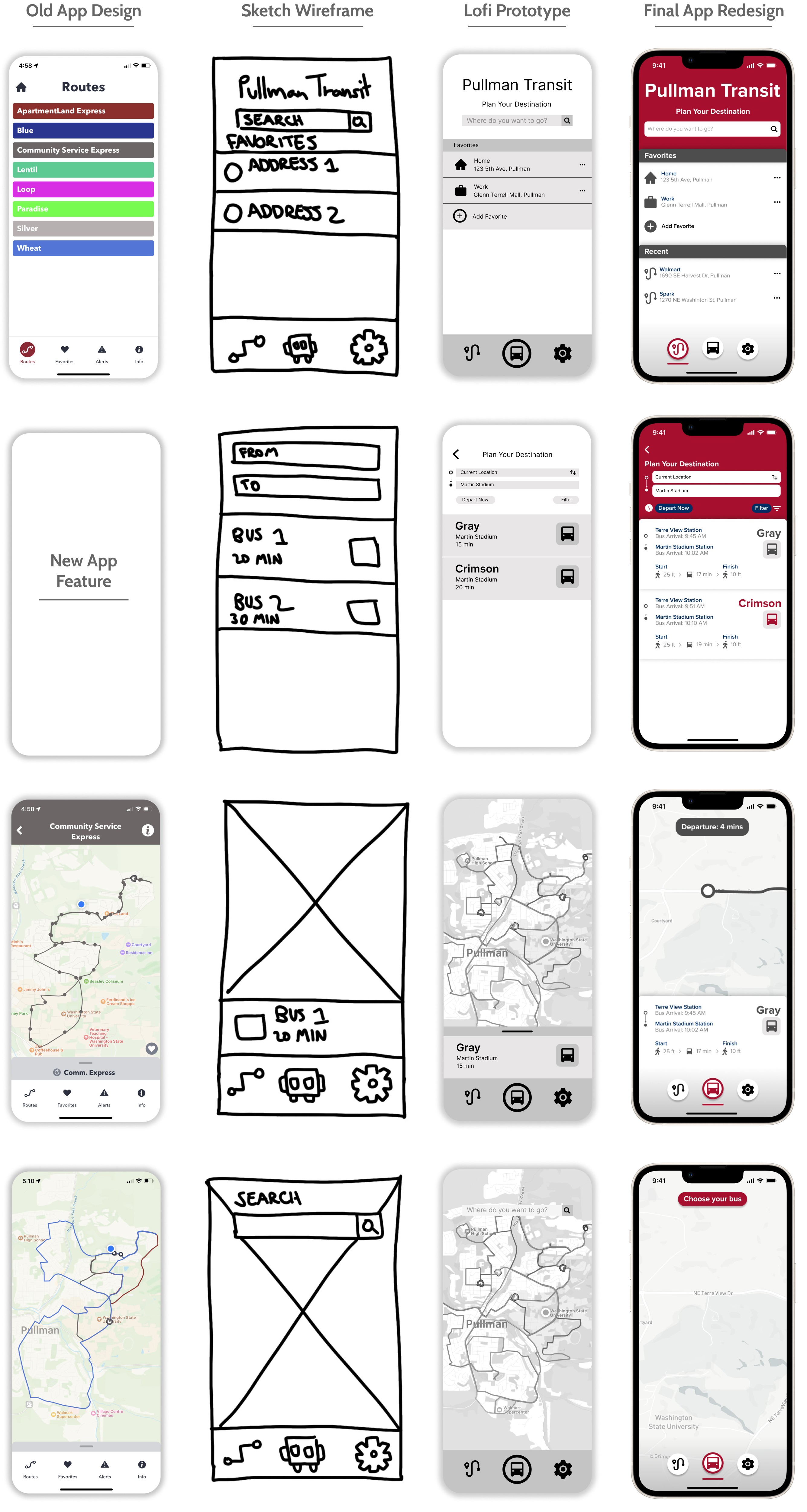
Paper Wireframes
I curated rough sketches of the Pullman Transit interface that would be most effective to solve the users issues. The interface I came down to create would allow the user to search for their destination in order to find the exact bus. I also did an overhaul of the navigation and information architecture. I designed it so that the first page a user is welcomed to is the "plan" page making the call to action of searching easier for the user to identify.

Low Fidelity Prototype
I then brought the sketches onto Figma to develop them into a low fidelity prototype. This prototype was then tested and shown to five participants in order to gather user feedback on their design thinking process while navigating the app.
Search Function

Results Page
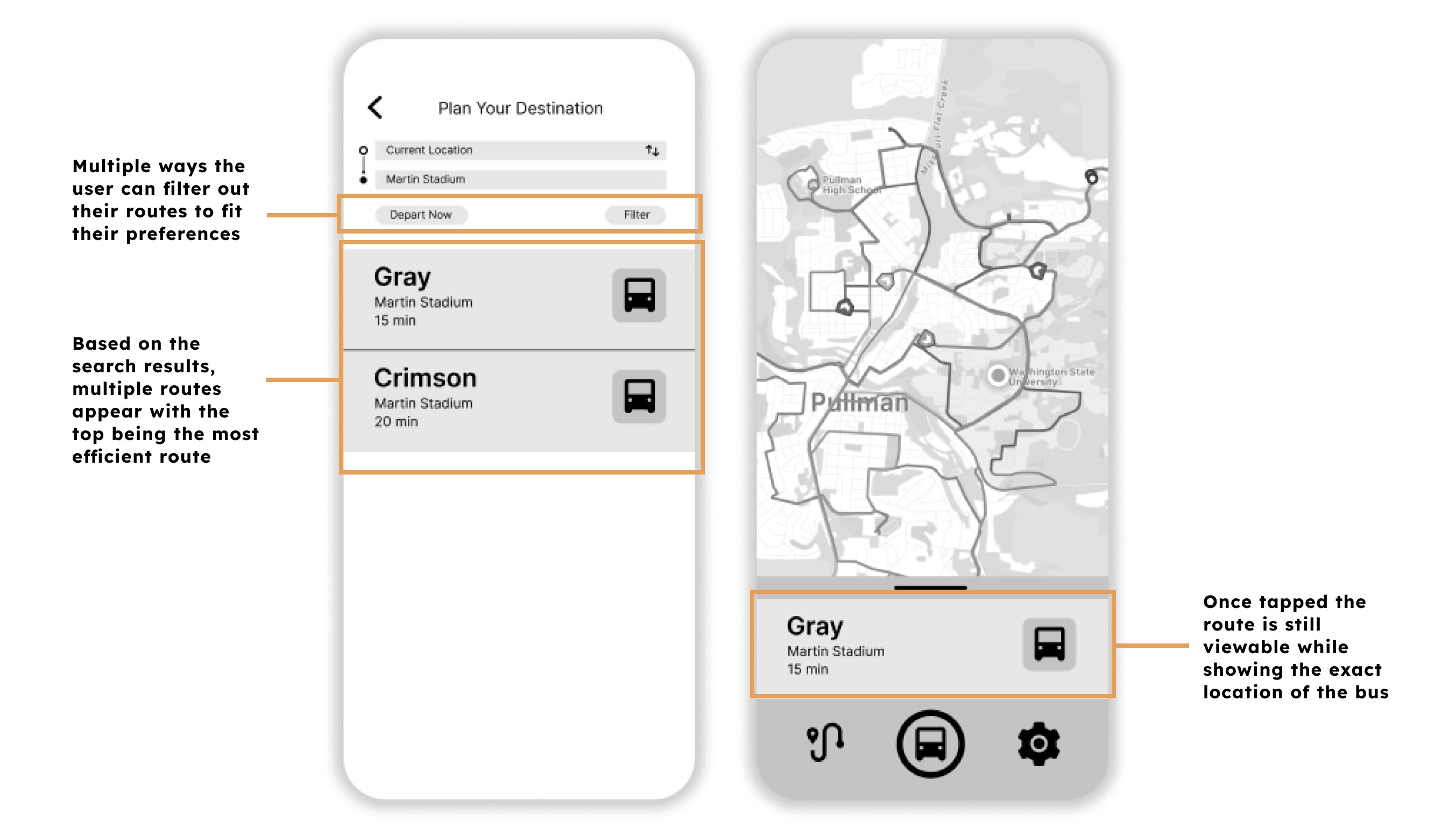
Live View

Testing
User Testing Results
I presented the low fidelity prototype to five participants and provided them with tasks to complete in order to learn more about their design thinking process. Findings from the user testing helped me see the changes that needed to be made to the low fidelity prototype. Some of the changes were to include a recents section when searching for a location. Another was that it was unnecessary to have two search functions on two different pages.
Recent section
While going through user tests, some participants pointed out how it would be helpful to see a history of their past searches. As I adjusted the prototype I added a "Recent" section in order to solve this problem. This would result in a decrease of user redundency of having to constantly repeat a search for a location.

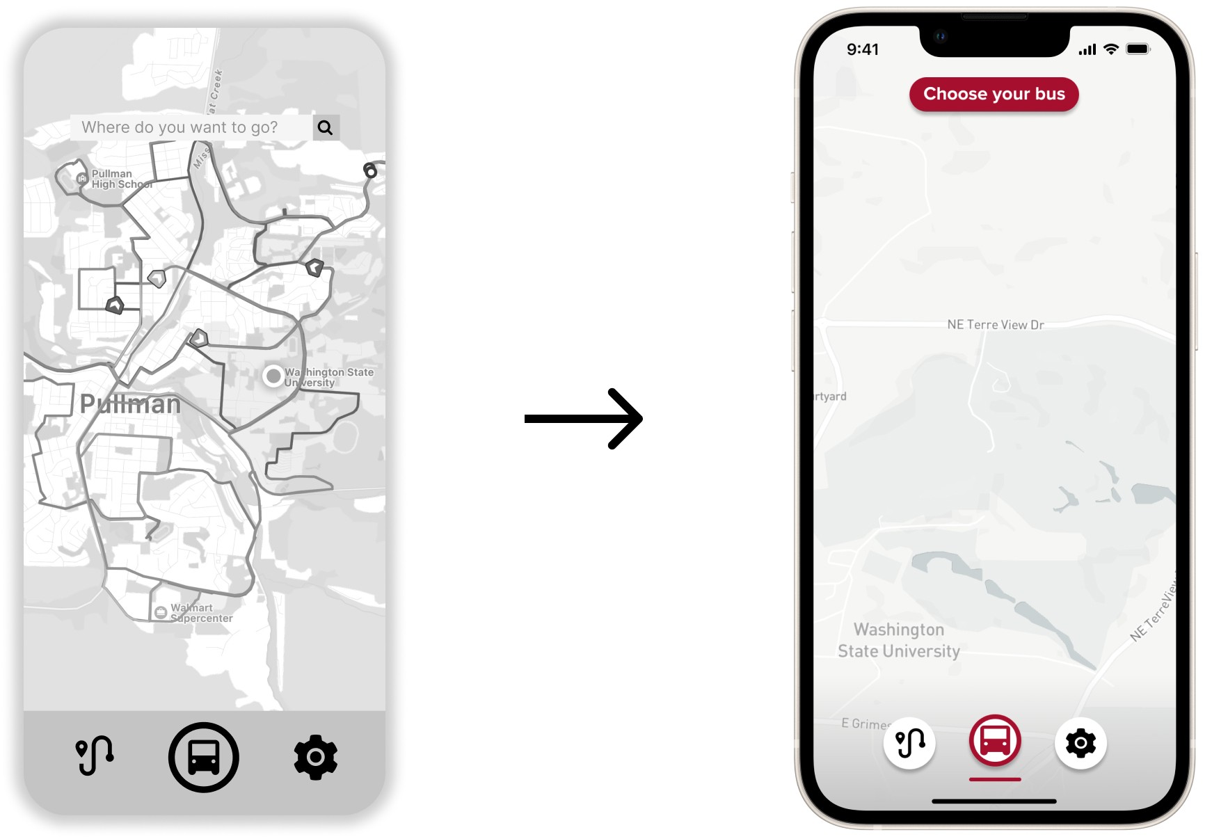
Bus selection
One participant pointed out how the search bar seemed unnecessary to have on the "Live" page since the “Plan your destination” page already incorporates it. I decided to solve this by replacing the search bar with a "Choose your bus" button. With this, the user would be able to save time if they know what bus to take and select from a number of buses to view their current locations.
Prototype
High Fidelity Prototype
View Prototype
Takeaways
What I learned
I have never used Figma before so I was able to learn how to utilize the tool. It was gratifying to familiarize myself with the tool and learn a new skill.
While creating the redesign I also realized how crucial an interface is to a user’s experience. An interface’s navigation could truly make or break an app or website. If a user is unable to figure out how to navigate an interface they would get frustrated and give up and lead to them uninstalling the app.
I also learned that the first ideas for the app are only the beginning of the process. Usability testing and peer feedback influenced each iteration of the app’s designs. When I go through user testing, the participants would provide ideas that I would have never thought of.
Future Steps
If I were to continue with Pullman Transit's redesign, I would continue to do more user testing in order to find more changes that need to be made. An app is never truly finished but with more testing it could lead to an app getting closer to perfection.
This project also provided me with more confidence and skills to use Figma in my future endeavors. This is important since it is extremely essential with user experience and user interface design. I believe Figma also provided me with the knowledge on how to curate a prototype and the essential elements to a great design, not only for the user, but also the company.