The 7 Tools
Increase Conversion Rates With a Website Redesign

Project Summary
Duration
3 months | March - May 2023
Role
UX/UI Designer
Deliverable
Responsive Website Prototype
Company Background
The 7 Tools is a business that provides courses and resources aimed at helping individuals overcome stress, parental challenges, and work-related issues to promote personal healing. Despite offering valuable services, the business has been facing a significant challenges with connecting with their target audience.
Problem Statement
How can The 7 Tools address the high bounce rate and low conversion rates on their website to effectively deliver their valuable services and connect with their target audience?
Solution
A website redesign proved to be necessary and was aimed at improving the user experience and addressing the identified pain points. The redesign focused on enhancing navigation, simplifying the checkout process through clear call to actions, and creating a scannable and visually appealing layout. These changes would prove to be effective as they reduced user task completion times by upwards of 90% and increased the overall user satisfaction.
Research
A Website in Need of Its Own Mental Reset
To start the project I conducted 5 user interviews from the target demographic of The 7 Tools in order touncover user pain points and identify key barriers they encounter while navigating the website.
60% found it difficult to navigate
Some titles and call to action buttons were confusing and required more emphasis.
60% found it not engaging enough
One participant suggested that including a banner with a compelling tagline at the beginning would hook the user and make them more inclined to explore the website.
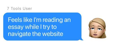
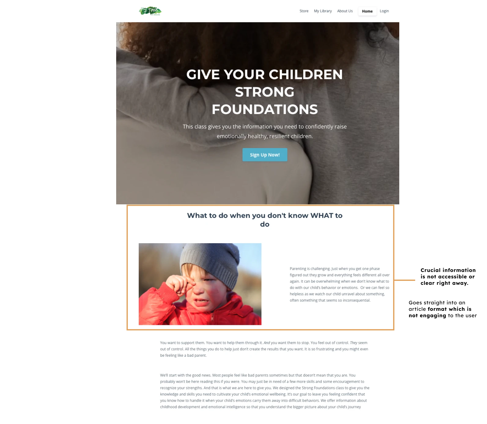
100% found it overwhelming
It's disorganized structure and excessive amount of text. Important information, such as testimonials and the benefits of certain courses to the user, are found not easily accessible and are often buried at the bottom of lengthy paragraphs.
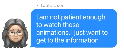
Another key pain point was unnecessary mouse hover animations. Many didn’t notice how some information was hidden behind a hover action. The website as a whole needs to be simplified and streamlined to make it easier for users to find information they are looking for.
What the Competition Gets Right
I then conducted a competitive analysis on direct (Aha! Parenting, Big Little Feelings) and indirect (Coursera) competitors to gain insights as I make certain design choices on the redesign. These websites seem to be comparable competition to the offerings of The 7 Tools.
I was able to understand the strengths of other course websites in the market as well as the features users are accustomed to which helped inform my own design decisions.I was also able to identify gaps or areas for improvement in The 7 Tools website throughout the comparison.
First Impressions - The 7 Tools

First Impressions - Coursera

Scannability - The 7 Tools

Scannability - Aha! Parenting

Accessible Information - The 7 Tools
Accessible Information - Big Little Feelings

Define
What’s Stopping Users from Clicking "Buy"?
Frustrating to navigate
When locating information to validate to purchase a product. This causes the user to fail to complete a check out reducing conversion rates for the business.
Difficult to stay engaged
The website’s page structure is causing unnecessary confusion for its users, thus increasing bounce rates as the user leaves to search for a new resource.
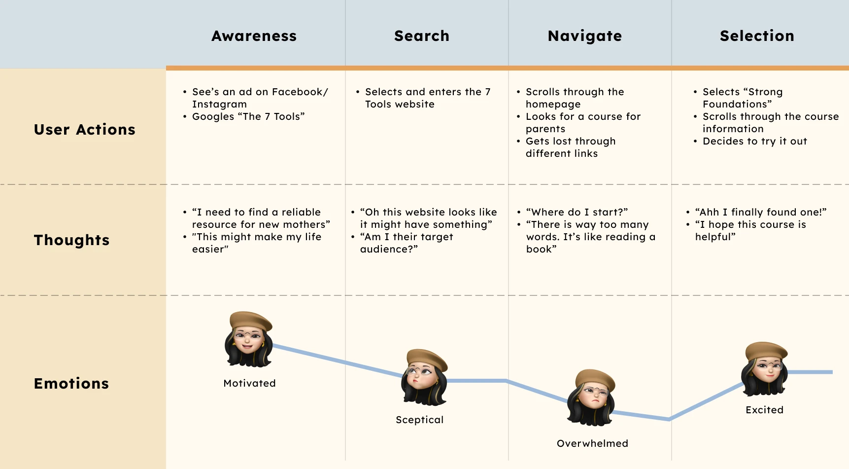
Identifying the user

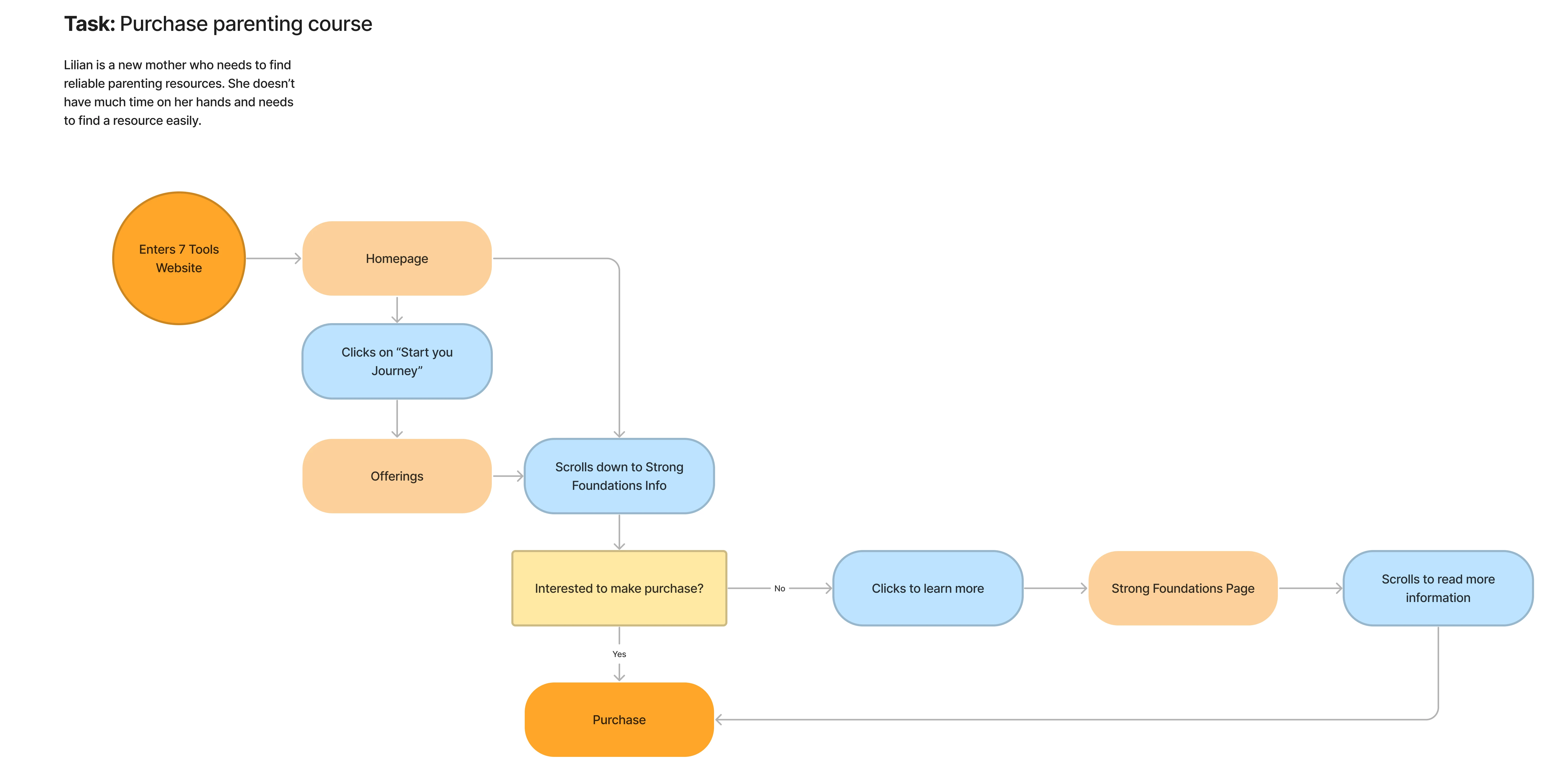
Mapping out the user's journey
Ideate
Sharpening the 7 Tools Website
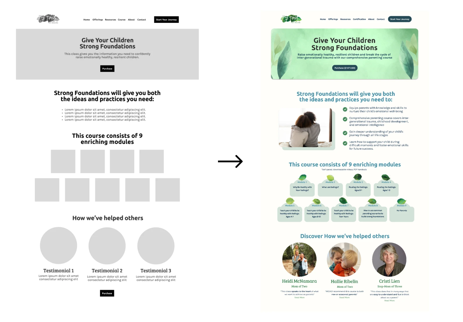
Emphasizing the call to action
Making sure the call to action on the website is clear for the user to identify at first glance. This will simplify the checkout process and in turn create a higher conversion rate
Adding a tagline/banner
This will help provide users context as well as engage them quickly with the website. This addition will help possibly reduce bounce rates as users will understand the website's purpose and encourage them to explore further.
Overhauling the navigation
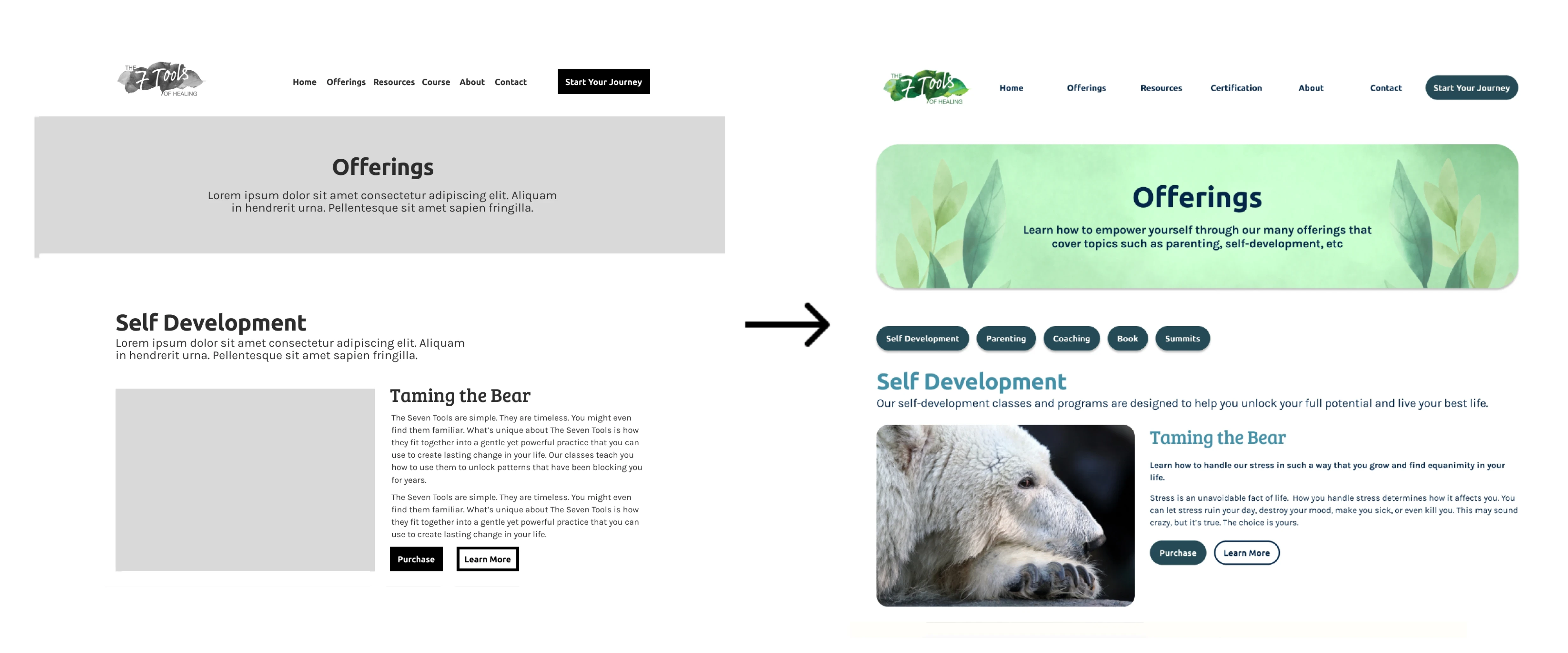
I restructured it so that the offerings are now categorized by sections such as “Self-Development” & “Parenting” allowing the user to quickly find their specific product.
Scannable page layout
I attempted to use a more strategic organization approach to help the user retain the website information easier and quicker. My main issue to tackle was the overwhelming text.
Homepage

Offerings page

Product page

Testing
A Faster, Friction-Free Experience
78.75% decrease
Complete a purchase on a course for new mothers:
Current site average: 80 seconds
Redesign average: 17 seconds
90.14% decrease
Locate what is included in the course and testimonials:
Current site average: 142 seconds
Redesign average: 14 seconds
A Few Tweaks for a Smoother Experience
Integrated anchor links to allow users to locate their desired product more efficiently. A participant pointed out how it would be helpful to provide quick methods to specific sections on the offerings page.

The clear hierarchy and visual enhancements contributed to a more easily scannable experience. The reorganized page structure allowed users to quickly locate and access the most important information first.
Old 7 Tools Design

7 Tools Redesign

View Prototype
Takeaways
What I learned
Scannability and visual hierarchy: Creating a visually structured layout with a clear hierarchy of information helps users quickly scan and locate relevant content. Text hierarchy, visual cues, and strategic organization of content enhance the overall readability and user-friendliness of the website.
Context and engagement: Providing a tagline or banner at the start of the homepage helps engage users and provide immediate context about the website's purpose and offerings. This can lower bounce rates and encourage users to explore further. Navigation and information architecture: Effective navigation and well-organized information architecture are crucial for users to find specific products or information quickly. Categorizing offerings and integrating quick links or anchor links improve the user experience by facilitating efficient navigation.
Conversion rates and bounce rates: The redesign focused on improving conversion rates by simplifying the checkout process and reducing bounce rates by enhancing engagement and providing an easily scannable experience. Monitoring and analyzing conversion rates and bounce rates can help measure the effectiveness of design changes and inform future iterations
Future Steps
Development and implementation: Collaborate with developers to translate the high-fidelity design into a fully functional website. Work closely with the development team to ensure that the design is implemented accurately and that the user experience is maintained during the development process.
Usability testing with a larger user group: Conduct usability testing with a larger group of users to gather more diverse feedback and validate the design decisions. This will help ensure that the improvements made in the prototype effectively address user needs and pain points.
Continuous monitoring and analytics: Implement analytics tools to monitor website performance, conversion rates, and bounce rates. Continuously analyze user behavior and metrics to identify areas that require further optimization or refinement.
User testing for new features: As new features or updates are introduced to the website, conduct user testing to ensure that they align with user expectations and improve the overall user experience. Iterate and refine these features based on user feedback and insights.
